Google appears to be moving closer to introducing a more visually ambitious redesign for Google Wallet, with a newly uncovered app version revealing a more polished and cohesive interface centered around color-driven navigation.
The latest preview comes from Google Wallet version 26.18.910990572, where developers have continued refining changes first spotted in late March. While the redesign is not yet publicly available inside the app, the updated build offers a clearer picture of how Google is reshaping the experience around passes and stored cards.
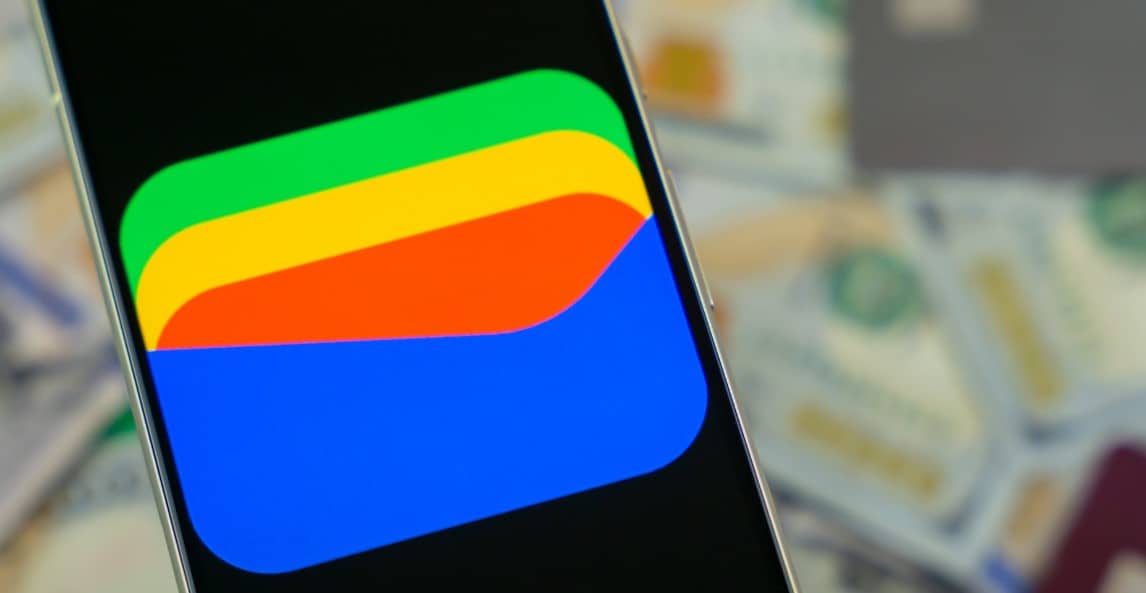
The core idea remains familiar. Individual passes continue to carry distinct colors that help users quickly recognize tickets, cards, and other stored items at a glance. What has changed is the extent to which those colors now define the entire interface.
In the newer build, the assigned color for a pass spreads across much more of the screen, creating a unified backdrop instead of remaining limited to smaller background accents. The result is a noticeably bolder presentation that leans more heavily on visual recognition than traditional menu-heavy layouts.
The updated interface also appears technically more refined than the earlier preview shown weeks ago. Transitions between screens and interface elements now move more fluidly, with fewer abrupt visual breaks. Earlier versions of the redesign reportedly showed awkward curved edges and inconsistent layering during animations, but those issues now seem largely resolved.
The redesign reflects a broader shift in modern mobile app design, where companies increasingly use color, motion, and simplified visual hierarchy to reduce friction in navigation. Google Wallet already relied on color to distinguish between different passes, but the revised approach pushes that idea much further by making the color treatment central to the overall experience.
At this stage, Google has not announced when or whether the redesign will roll out publicly. The latest preview, however, suggests the work is approaching a more finalized state compared to the unfinished concepts previously uncovered.
For users, the changes would likely be most noticeable during everyday interactions — quickly locating a boarding pass, transit card, or event ticket without needing to scan through dense lists or text-heavy menus. The redesign does not appear to fundamentally alter how Wallet functions, but instead focuses on making the interface feel more immediate and visually intuitive.
Read More:
The current preview remains limited to development work inside the app, leaving the existing public version of Google Wallet unchanged for now. Even so, the steady visual refinements indicate that Google continues to invest in making Wallet not just functional, but easier to navigate at speed on increasingly crowded mobile screens.
Follow iNews Zoombangla On Google
Open the Google follow page and tap the checkmark option to receive more updates from iNews Zoombangla in your Google news feed.