Apple Pay users checking out in apps or on the web will notice a different screen in iOS 27. Apple has redesigned the payment interface, changing how users switch cards and review payment details before confirming a transaction.
The updated checkout screen addresses two problems found in the previous design. Switching between payment cards could feel unclear, while important details were not always easy to scan before paying.
In iOS 27, additional cards appear beside the default payment card. Their placement signals that users can swipe left or right to choose another card.
That small design change makes card selection easier to understand. Users no longer need to work out which part of the checkout screen opens the card selection menu.
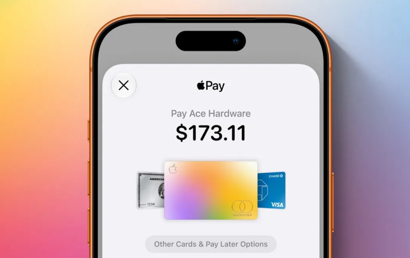
The previous design could cause confusion because tapping near the active card could instead open address information. A user then had to return and locate the correct card selection option.
Apple has also changed how payment information appears on the screen. More details are visible at the same time, reducing the need to move between separate parts of the checkout interface.
Colorful icons now help identify information such as shipping method, shipping address and billing address. The layout is designed to make those details easier to distinguish before payment is approved.
That matters because Apple Pay checkout is a short process. Users normally review the transaction and then double click to authorize payment. A clearer screen gives them another chance to notice an incorrect card, address or shipping choice before completing the transaction.
The redesign arrives as Apple Pay has become widely available across apps, websites and retailers. Even Walmart has added support, according to the information provided, extending Apple Pay to another major retail environment.
Changing a familiar payment screen carries some risk. People build habits around interfaces they use repeatedly, especially when money is involved. Apple has kept the basic payment process familiar while changing how information and cards are presented.
The result is less about adding another payment feature and more about removing friction from something users already do.
For people who regularly keep several cards in Apple Pay, the swipe based card selection may be the most noticeable change. Others may find the improved display of addresses and shipping information more useful.
Apple Pay itself still performs the same basic job. In iOS 27, Apple has focused on making the final few seconds before payment easier to understand.

Follow iNews Zoombangla On Google
Open the Google follow page and tap the checkmark option to receive more updates from iNews Zoombangla in your Google news feed.